Visual identity · Identity and culture
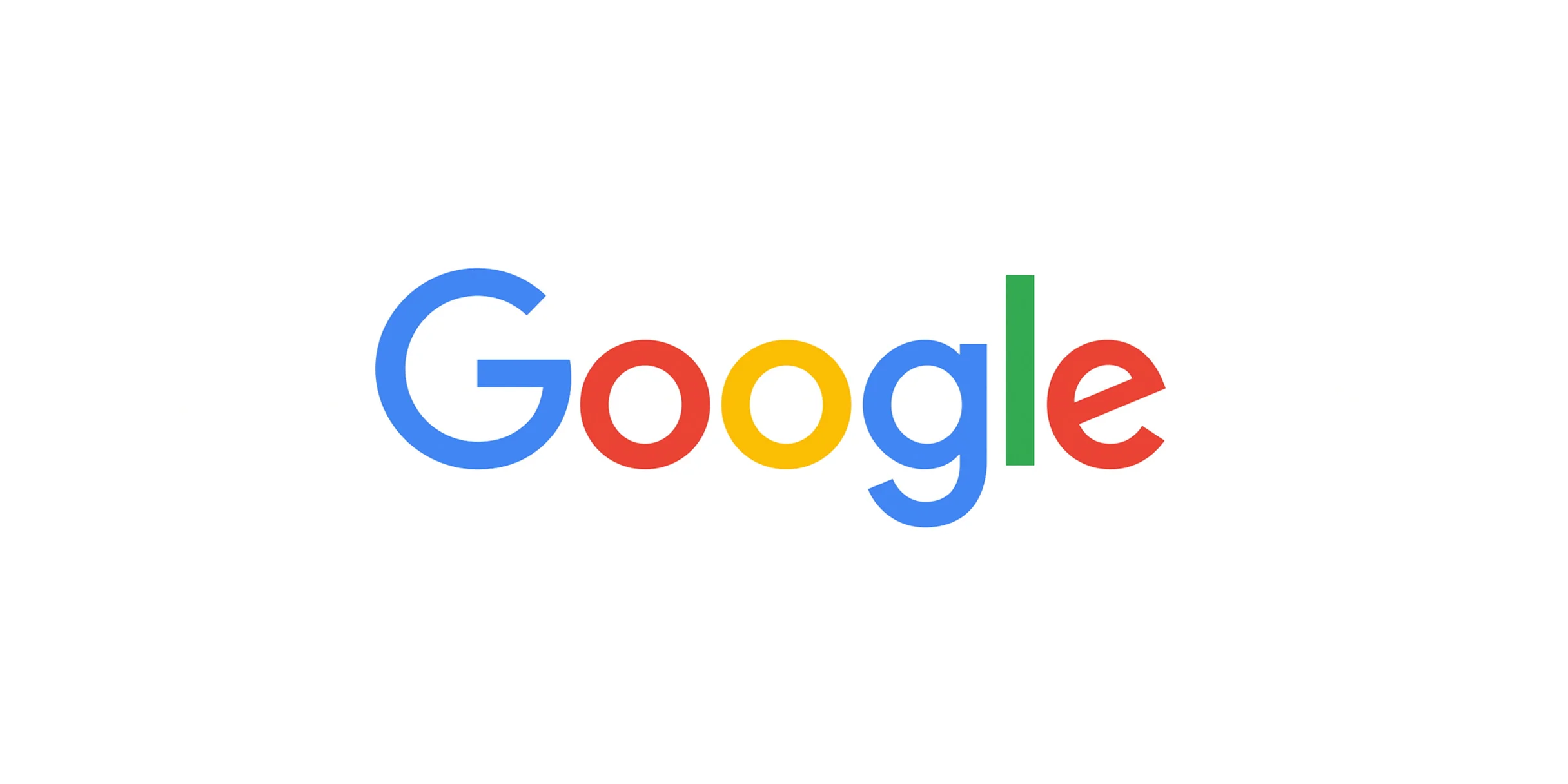
The sans-serif logo of 2015
A month after announcing Alphabet, Google introduced a sans-serif logo. The color order was kept, the tones were softened and the e stayed tilted. The G icon shown in browser tabs went from blue to four colors. On the home page, the new logo appeared in an animation of a hand writing in chalk.
September 1, 2015
Google logo (2015)
Visual identity · Identity and culture · Active
Dates
- September 1, 2015 Launch · exact date [1]
What the sources say
Historical captures
No archived capture has been located for this record yet.
Sources
- Google rebrands with new sans-serif logo — Emma Tucker — Dezeen, September 1, 2015. Source secondary · accessed November 2, 2026 · look for a copy on the Internet Archive
What still needs documenting
- Official logo introduction post
- Name and license of the typeface used in the design
On GD
GD has followed Google since 2006. Search GD for “logo do Google” (in Portuguese)
How to cite
"The sans-serif logo of 2015", Google Museum (GD), https://gd.eurisko.com.br/museu/en/collection/logotipo-google-2015/, CC BY 4.0. Reviewed on November 2, 2026.
ID: logotipo-google-2015 · Reviewed on November 2, 2026